Walford Graham Robertson and the Construction of A Pre-Raphaelite Collection (1896)
Walford Graham Robertson and the Construction of A Pre-Raphaelite Collection (1896)
By Susie Beckham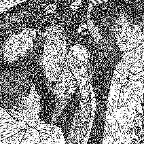
Abstract
In 1896 the Goupil Gallery in London staged an exhibition titled A Pre-Raphaelite Collection. Walford Graham Robertson—a wealthy young artist, theatre designer, and recent model for John Singer Sargent—was commissioned to create a poster to advertise the show. Rather than simply replicating a painting from the exhibition, Robertson devised a composite Pre-Raphaelite image that blended specific artworks and tropes of the school. This article explores Robertson’s interpretation and communication of the “Pre-Raphaelite” at the close of the century, drawing on semiotic models to consider the poster’s articulation of the Pre-Raphaelite “sign”. It concludes with the suggestion that the ability to break apart and reassemble the very idea of the “Pre-Raphaelite” in this public-facing work is indicative of Pre-Raphaelitism’s status by this time as an example of living textuality.
Introduction
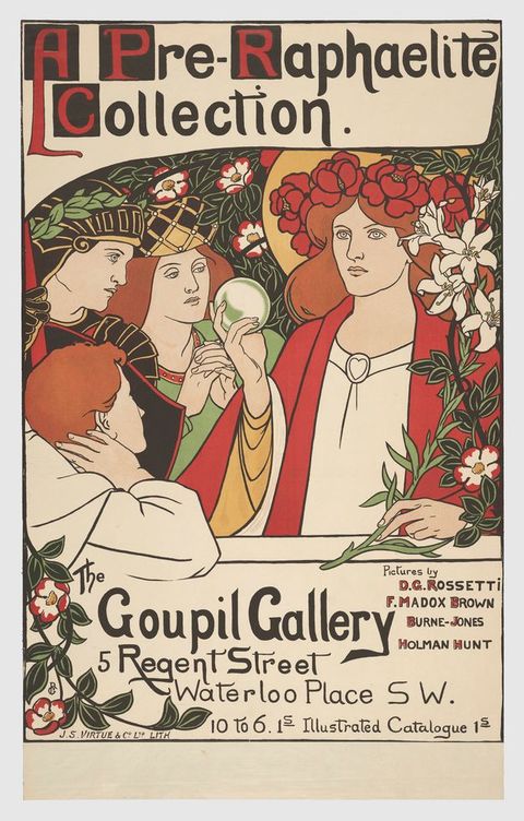
Four figures are clustered together in a dense, flowering woodland, filling the central space of a chromolithographic poster (fig. 1). The three on the left—an adolescent boy, an armoured knight, and a woman with her hands clasped in prayer—gaze in adoration at a haloed woman on the right, who wears a crown of flowers. Something about this scene makes it look Pre-Raphaelite, but what is it? Is it the poses of the figures, their costumes, the setting, or the use of line and selection of colour? The text “A Pre-Raphaelite Collection” confirms this, for the poster advertises an art exhibition at the Goupil Gallery on 5 Regent Street in London from June to July 1896, which is open between 10 a.m. and 6 p.m.; admission and the accompanying catalogue cost a shilling each. Below the scene on the right, the designer highlights the exhibition’s inclusion of pictures by Dante Gabriel Rossetti, Ford Madox Brown, Edward Burne-Jones, and William Holman Hunt, names associated by audiences both then and now with the Pre-Raphaelite movement.
The show, featuring seventy-two paintings from twenty-nine artists, was made up of works owned by the late James Leathart, a notable Newcastle lead manufacturer and art collector who patronised the Pre-Raphaelites (fig. 2). As a whole, however, it contained a far wider range of styles, subject matter, and production dates beyond this school. It was an important exhibition because most of the pictures were for sale. This marked a broader shift in the late Victorian art market towards the private sale of major art collections.1 Pre-Raphaelite artworks were shown alongside classical aestheticist pictures from Frederic Leighton and Albert Moore, together with earlier, more academic works from artists such as William Turner of Oxford and William Etty.2 Reviews of the exhibition convey a firm conception of what constitutes “Pre-Raphaelite” art, with critics noting the inclusion of “many names that are not usually considered to belong to that school” and isolating specific works as being “somewhat absurd to find classed with ‘pre-Raphaelite’ art”.3 Nevertheless, both in the name of the exhibition and in the manner in which it was advertised, Goupil capitalised on the familiarity and desirability of a Pre-Raphaelite framing for the show.
1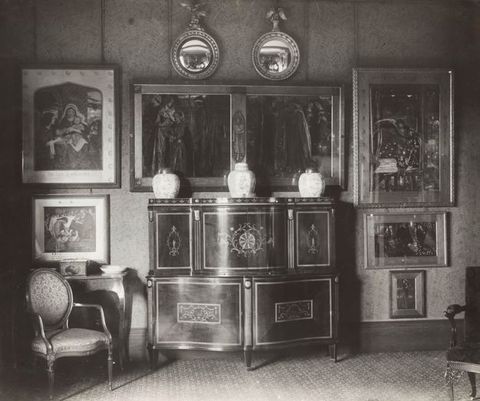
Goupil’s manager and exhibition organiser, David Croal Thomson, was probably responsible for commissioning Walford Graham Robertson to create the poster, although no specific instructions or specifications for the work have survived.4 In its simplicity of design it differs from both Goupil’s house style and other typical exhibition advertisements for this period, which often consist of single figures and empty backgrounds. Rather than reproducing or copying and pasting a figure from an existing painting (perhaps one of Leathart’s artworks), Robertson created a window onto a Pre-Raphaelite world.
4This brings us to the question of how we should approach this original Pre-Raphaelite image. As noted, it certainly looks Pre-Raphaelite—but how exactly? It displays many of the tropes associated with the movement—beautiful red-haired women, a chivalric knight, medieval costume, religious symbolism, and attention to the natural world—but what makes these ideas and their coming together specifically “Pre-Raphaelite”? That the poster uses a composite image of reshaped references to communicate a distilled image of Pre-Raphaelitism only raises more questions. For example, if the figures and details are derived from specific images only in part, what might the selection tell us about the ways in which Pre-Raphaelite art was understood in the 1890s? After all, the interpretation of this term’s meaning has never been fixed. While, over the last 175 years, critics, curators, art historians, and even members of the original Pre-Raphaelite Brotherhood have stated what they think Pre-Raphaelitism absolutely is and absolutely is not, its curious capacity for both communicating and evading clear meaning has been a key factor in allowing the term to possess a longevity and intermedial application beyond that of any other art movement.
What was Robertson’s relationship to Pre-Raphaelitism? With this poster, Robertson marks himself as a consumer of Pre-Raphaelite visual culture and an active participant in its extended life and semiosis by declaring his understanding of what constitutes Pre-Raphaelitism. He does not limit himself to the depiction of figures from Leathart’s collection. Instead, his hybrid deployment of existing figures from Pre-Raphaelite art alongside allusions to medievalism, mysticism, religiosity, romance, and enchantment reflect his understanding of the wide-ranging attributes of Pre-Raphaelitism. This points to the capacity of the Pre-Raphaelite “sign” for fragmentation and reworking even as it retains its vitality as a coherent phenomenon.
This article investigates the semiotic strategy of Pre-Raphaelitism at the fin de siècle via the medium of Robertson’s poster. An advertisement is appropriate for such a study because, as Roland Barthes recognised, “the signification of the image is undoubtedly intentional; the signifieds of the advertising message are formed a priori by certain attributes of the product and these signifieds have to be transmitted as clearly as possible”.5 This is far from the first study to consider Pre-Raphaelite semiosis. In the 1980s Deborah Cherry and Griselda Pollock interrogated Pre-Raphaelite texts, exhibitions, and related publications to consider how they are harnessed to produce signs, but focused primarily on their patriarchal connotations.6 As such, they investigated the framing of women as ciphers of masculine creativity and the production of a gendered idea of Pre-Raphaelite art and artists (that is, how particular signs are elevated to create an additional layer of meaning, defined as semiotic myth7) but did not attend to the overall visual, semiotic identity of work within this category. I address this gap in the scholarship by analysing the primary sign level of Pre-Raphaelite art and the perception of its archetypal formal characteristics. I position Robertson’s poster in the context of its identity as an advertisement and as an artwork that adapts, blends, reformulates, and performs a popular interpretation of Pre-Raphaelite art at the close of the nineteenth century. To this end, I draw on semiotics and approaches to mass culture to interrogate the process of signification in Pre-Raphaelite visual culture at the fin de siècle—with an eye to its communicative powers today.
5Walford Graham Robertson: Artist and Designer
In 1900 the art critic Marion Spielmann acknowledged that he had “gone into unusual detail” in his discussion of Robertson’s career and pictures because he “is an artist of whom hardly anything has yet been written, yet who merits far greater recognition than he has received from the general public”.8 Unfortunately, not much has changed. To date, art history has typically only mentioned Robertson in passing, usually in relation to his art collecting and to his having modelled for a portrait by John Singer Sargent (fig. 3).9 In 1897 this poster was celebrated for being “able to provide, with his small group of women in the manner of Rossetti, a colour effect of remarkable finesse, but at the same time took into account the style and nuances of the work of the exhibiting artists to skilfully reproduce their type”.10 Despite this contemporary recognition, there is scant analysis of Robertson’s work in modern scholarship. While reproductions of this poster have become a mainstay on e-commerce platforms such as eBay, this familiarity has not been replicated in academic research.11 The value of this poster to the study of Pre-Raphaelite receptions—and to Robertson’s role as a contributor to the Pre-Raphaelite canon—has therefore been ignored.
8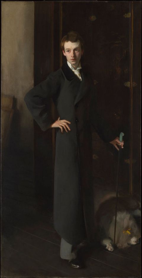
We do not know the details of Robertson’s commission, but he was already familiar with the Goupil Gallery by this time. His autobiography recounts his regular movements around London’s art scene, including a letter sent to his new friend James McNeill Whistler in 1891, in which he details a visit to Goupil to see his portrait of Thomas Carlyle.12 Robertson’s direct acquaintance with Thomson, Goupil’s manager, is also evidenced in letters between them and Whistler in 1892–94 regarding requests to borrow Robertson’s two Whistler paintings for various exhibitions. Thomson may have become aware of Robertson’s own talent as an artist and designer around this period.
12Robertson had honed his early artistic skills at the South Kensington schools, which was followed by tutelage under Walter Crane, Thomas Armstrong, Albert Moore, and Burne-Jones.13 By the time of the poster commission, he had established himself as a painter who exhibited primarily portraits of his theatre friends—including Sarah Bernhardt, Ellen Terry (fig. 4), and Julia Neilson—and paintings of women with romantic or mystical narratives that indicate his affinity with Pre-Raphaelite themes. In “Pre-Raphaelitism To-Day”, published in 1899, the writer Percy H. Bate describes Robertson’s paintings My Lady Greensleeves and The Queen of Samothrace as having been “inspired by Rossetti and Burne Jones” and as “pictures of individual merit and poetic charm” (figs. 5 and 6).14 Interestingly, Robertson appears to have later rejected this association. Spielmann’s profile of the artist notes that, while Robertson acknowledged that “there is colour” in the association of his work with Burne-Jones’s, he “would rather consider the connection an accidental one”, suggesting that “what Mr. Bate defines as ‘Pre-Raphaelite’ he would simply call ‘undeveloped’”.15 Spielmann’s own description of The Queen of Samothrace as “one of the most successful of the artist’s pictures, yet belonging to a period already disavowed, or, at least, to a style at present quite recanted”, refers to Robertson’s recent engagement with Pre-Raphaelite themes and iconography, prior to supposedly distancing himself from the style.16 Nevertheless, these sources attest to Robertson’s personal knowledge of and experience with Pre-Raphaelite aesthetics at the time of his commission.
13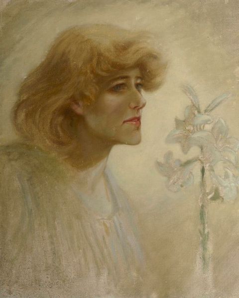
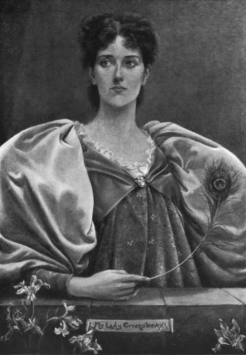
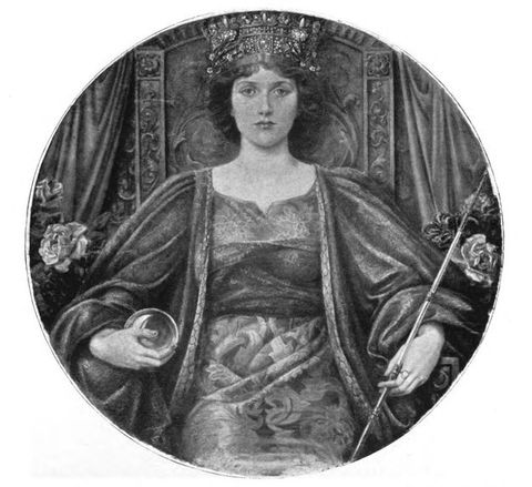
Robertson first exhibited his work in May 1889 at the New Gallery in London, with further pictures (prior to the Goupil commission) shown at the Institute of Painters in Watercolours (with the Society of Portrait Painters), the Dudley Gallery (with the New English Art Club), the Grafton Galleries, and the Royal Society of British Artists.17 By 1896 Robertson had also established himself as a designer for the stage. His long-standing and celebrated collaboration with Daly’s Theatre in New York as a costume designer began in the early 1890s with a production of Tennyson’s The Foresters in 1892, with further work on various Shakespeare productions.18 Robertson’s art historical literacy is demonstrated by this costume work. In a design for The Two Gentlemen of Verona, he illustrates “a barge with masquers representing Venus, the Graces, Love, Hymen etc”, noting that the Graces’ costumes should be “like the dresses in Botticelli’s ‘Primavera’” and that Venus’s costume should be modelled “from another picture by Botticelli” (fig. 7).19 Robertson had also established himself as an illustrator. His “well-executed, if extravagantly designed, illustration[s]” for Ernest Birch’s Five Songs were published in May 1889, at the same time as he exhibited his first painting, and were positively received by reviewers (fig. 8). He published further illustrations in periodicals such as The English Illustrated Magazine in May 1893.20 By the time he received the Goupil commission Robertson was therefore familiar with the task of adapting literary and art historical sources, and adept at fulfilling design briefs from external agents.
17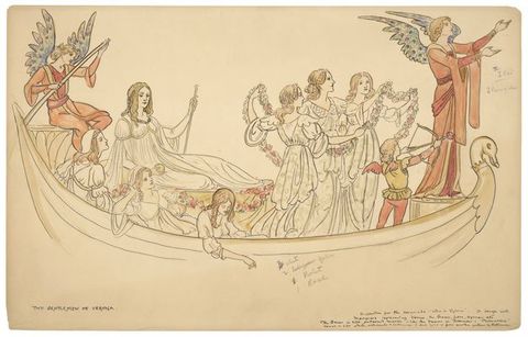
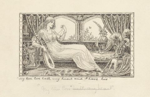
Posters at the fin de siècle
While it was produced for an advertisement, Robertson’s design belongs to the category of the artistic poster—a format that considered the poster itself as an artwork, in distinction from the commercial poster.21 Where commercial posters in London had been the subject of derision during the 1880s, cast as vulgar desecrations of the city landscape, the artistic poster of the 1890s was thought to be different.22 The French designer and lithographer Jules Chéret was celebrated by his contemporaries for having invented the artistic poster in the late nineteenth century.23 This new form, as the scholar Ruth E. Iskin observes, “aestheticized the crude commercial appeal of the earlier commercial poster through color, composition, and line . . . eliminating crude realism and melodrama in favor of a decorative sensibility . . . developing a modernist style that stressed flatness, abolished shading, and often used brilliant colors and bold outlines”.24 This bold, modern new look was exemplified in London by Aubrey Beardsley’s poster for A Comedy of Sighs! (1894). As noted by the art critic and historian Charles Hiatt the following year, “Nothing so compelling, so irresistible, had ever been posted on the hoardings of the metropolis before”, leading some to “[jeer] at it as a palpable piece of buffoonery” and others to “[gaze] at it with awe, as if it were the final achievement of modern art”.25 The artistic poster at this time was thus an exciting site for visual innovation: it became a significant draw for artists who wished to be freed “from the constraints of juries and from conventions related to the tradition of high art” and to make a more reliable living from poster commissions instead of trying to find buyers for their paintings.26 Robertson was independently wealthy and did not need to make money from his art.27 Nevertheless, this mode of design was attractive to many on account of its visibility to a large public audience and its longevity beyond its deployment as an advertisement. It was written about in the press and collectors preserved and exhibited their designs as fine art.28
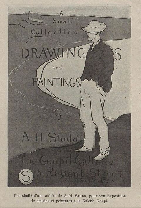
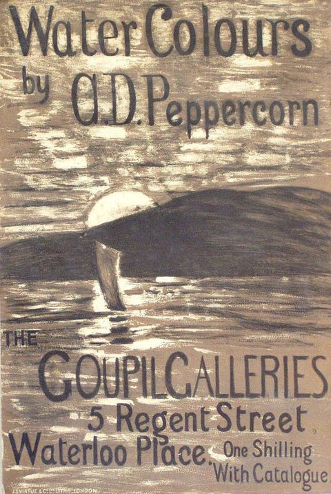
21Robertson was not the only artist to produce artistic posters alongside a fine art career. In 1891 Walter Crane designed a poster to advertise his own exhibition at the Fine Art Society.29 In 1897 the authors of Les affiches étrangères illustrées observed that “today, as soon as an artist thinks of exhibiting some of his works, he creates a poster which serves as an invitation card”, highlighting general examples by Phil May (fig. 9), Frank Brangwyn (untraced, probably produced for his one-man show in 1891), and Leonard Raven-Hill (untraced).30 They also drew attention to Goupil’s practice of using posters designed by the artists themselves to publicise solo exhibitions, citing examples from Arthur Studd, Arthur Douglas Peppercorn, and Philip Wilson Steer (figs. 10–12). Another such artist was André Sinet who, as Spielmann notes, “created a great impression by the poster he made for his exhibition at the Goupil Gallery, and his simple figure of a girl drawn in five colors was quickly acted upon” (fig. 13).31 The use of a limited palette of block colours appears to have been a favoured poster style for the gallery. In his book Picture Posters, Hiatt recalls Steer’s organisation of “a show of his own work” at Goupil, which he advertised through the design of an “excellent” lithograph poster “in four colours”.32 Steer’s design, a simplified take on his painting The Sprigged Frock (1890), was acknowledged by Hiatt to be “quite unlike this artist’s other work”: “it leans, it seems to me, towards Pre-Raphaelitism rather than towards Impressionism”, probably because of Steer’s use of a lone red-haired female figure for his subject (a conclusion to keep in mind as we proceed in our analysis of Pre-Raphaelite semiotics).33
29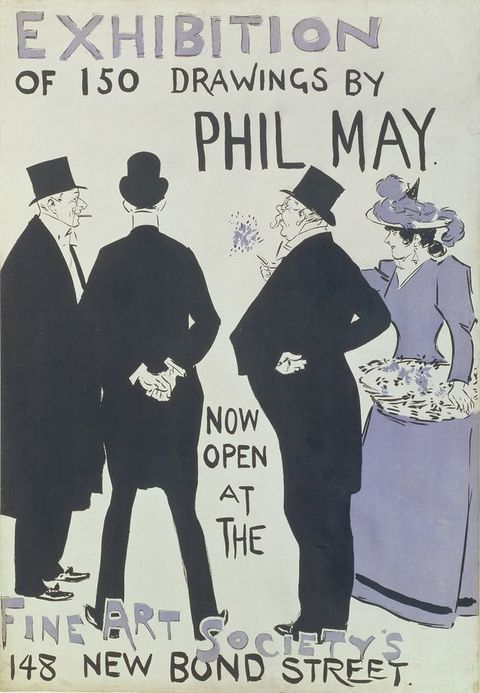
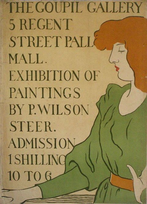
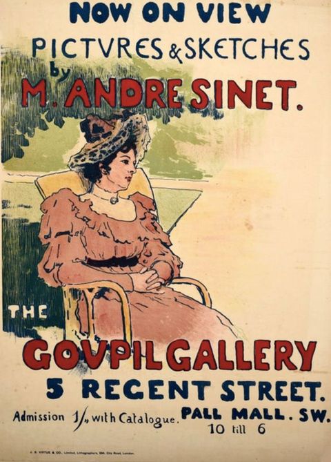
In Robertson’s poster the Pre-Raphaelite style of design directly reflects the content of the show. Robertson’s brief was also different. While his contemporaries were tasked with creating posters to advertise their own shows, Robertson had to sell both the Pre-Raphaelite Collection exhibition and Pre-Raphaelitism itself as a desirable commodity. His solution was to reflect the show’s title by creating a literal “Pre-Raphaelite collection” through a collage of images.
This was not the first time Pre-Raphaelitism had taken a form designed for broad public engagement. Twenty years earlier, the critic and writer Justin McCarthy had observed how “we now have in London . . . pre-Raphaelite hair, eyes, complexion, dress, decorations, window curtains, chairs, tables, knives, forks, and coal-scuttles. . . . From pictures and from life they have passed into the Christmas cards of congratulation and good wishes which we all send to our friends on the 25th of December”.34 For some theorists, this is the very nature of the culture industry: it subdues unruliness by subordinating artistic effects to a “formula which supplants the work”.35 We could argue that the poster embodies this idea and subdues the unruliness of the definition of “Pre-Raphaelite” by subordinating it to a formula that supplants the original painted works from which it derives. However, I suggest that, far from diminishing Pre-Raphaelitism’s conceptual value and appeal, this act illuminates its semiosis at the close of the century by providing a significant tool for studying its popular reception and comprehension. Further, through close looking, the apparent simplicity of Robertson’s reduction of Pre-Raphaelitism to a cluster of four characters makes way for more complex and nuanced readings.
34Quotations and Significations
The poster’s semiotic strategy is anchored by its title. It is not advertising a collection of contemporary art broadly conceived, nor is this imagery to be confused with art of the aesthetic movement, which has similar attributes: it is a Pre-Raphaelite collection. This framing of the Leathart show is underlined by sections of text in Robertson’s design. Of the twenty-nine artists represented in the exhibition, just four are named on the poster:
Pictures by
D. G. ROSSETTI
F. MADOX BROWN
BURNE-JONES
HOLMAN HUNT
The initial letters of the artists’ names and the capital letters in the poster title are rendered with rectangular surrounds in the manner of Lombardic capitals and emphasised with bold red text, mimicking the medieval manuscript practice of rubrication.36 While heightening the medieval character of the overall design (which I shall return to shortly), this feature can also be read as an allusion to the important role of initials in the early history of the art movement, where the members of the Pre-Raphaelite Brotherhood attempted to covertly declare their identity through the addition of the letters “P.R.B.” to their paintings, a story repeated in the press and familiar to the public. Robertson’s singling out of these four men, so often associated with Pre-Raphaelitism in the popular imagination, further emphasises the Pre-Raphaelite connotations of the overall design. However, the correlation of the number of names with the number of figures encourages a slower, more methodical reading of the poster and, I argue, alludes to the folding of specific sources into the scene. This is not to say that the poster’s semiosis relies wholly on the viewer’s recognition of any particular artistic references. Instead, as I shall show, the integration of these models speaks to the poster’s attention to the creation of an authentic Pre-Raphaelite design and the specificity, say, in the illustration of a particular type of knight to relay its “Pre-Raphaelite” character and enhance its significance. I shall identify the signs within Robertson’s poster and the meaning they collectively produce through an examination of the poster’s four figures, their reliance on specific Pre-Raphaelite sources, wider precedents, and familiar tropes—as well as a consideration of the implications of these references for the poster’s narrative reading.
36I begin with the poster’s main figure of a haloed woman with red hair, portrayed at a slight turn and gazing into the distance. She is a Rossettian type, as contemporary reviews observed, but has not been copied from a single source. Her crimson robe over a white chemise and the heart at her throat recall Rossetti’s Regina Cordium (fig. 14). Robertson simplifies the necklace to an embroidered outline on the neckline of the chemise and adds a crown of red flowers to the woman’s head to further encourage a reading of her as a Rossettian queen of hearts.37 Her regal status is emphasised by the objects in her hands: in her right, she holds a glass sphere (a popular ornament in the pictures of Pre-Raphaelite associates) and in her left a stalk of lilies.38 These symbols present an alternative to the traditional sovereign’s orb and sceptre, which symbolise godly power and good governance. The substitution of lilies for a gold sceptre adds a further Christian context to the character’s reading, with a nod to early Marian Pre-Raphaelite paintings, as well as to the Pre-Raphaelites’ devotion to nature. Her head is surrounded by a golden halo. Is she meant to be a saint and the stalk of lilies a kind of martyr’s palm? The monarchic subtext of the combination of the stalk and the orb troubles this reading. The key to deciphering this figure appears to lie in a palimpsestic reading of her as both Rossetti’s Regina Cordium and Venus Verticordia (fig. 15).39 Venus Verticordia shows the Roman goddess of love holding a sphere and a sceptre (an apple and a Cupid’s arrow), also against a heavy backdrop of flowers. Rossetti gives his pagan Venus a halo, “a sign of her sanctity”, to emphasise her moral stature, whereby she has the power to turn sexual promiscuity into sexual virtue and modesty.40 Robertson’s figure, hence, appears to embody both a queen of love and a pagan goddess of beauty who is marked as sacred.
37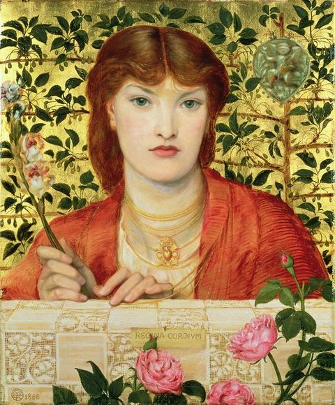
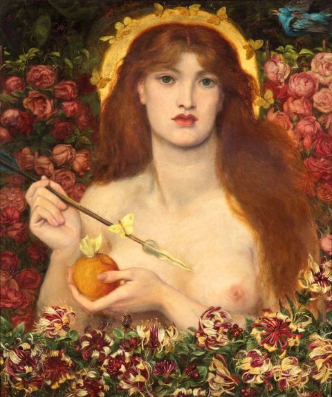
That the poster revolves around a Rossettian subject (and Rossetti is named first in the list of featured artists) is unsurprising given Robertson’s reverence for the late painter-poet. In his autobiography, he recounts how “the first public exhibition of [Rossetti’s] collected works [i.e., the memorial shows of 1883] . . . left upon me one of the most profound impressions of my life”: “I well remember my first sight of the pictures”.41 This experience instilled in him a great “enthusiasm for the newly realised Wonder Man” and led him to seek out “all the information I could collect as to his life, sayings, and doings” and to become acquainted with those “who had known him in his brilliant youth and ranged themselves with him under the Pre-Raphaelite banner”.42 Indeed, Robertson’s imitation of Rossetti’s work here (and, as will be shown, elsewhere) may have been an attempt to get closer to Rossetti, who had died before they had a chance to meet.43 The primacy of this figure in the poster reflects Robertson’s esteem for Rossetti, and at the same time plays on the popular association of Rossetti and his pictures of women with Pre-Raphaelitism as “art whose aim is beauty”.44 In the mid-1850s the term had often been associated with “a preference for ugliness over beauty”: that the three figures on the left gaze in the direction of this sacred female representative of love and beauty speaks to the dominance of these characteristics in the late nineteenth-century understanding of Pre-Raphaelite art.45
41In the left foreground, a male figure with short red hair in a white robe leans against a ledge separating the picture from the text below. His appearing lower in relation to the other figures indicates his younger age, and his costume resembles a religious habit, although the absence of a halo suggests that he is not a holy figure.46 The figure’s worshipful gaze at the goddess, and his clothing, suggest a devotional connection, which alludes to the Pre-Raphaelites’ commitment to truth and nature. This polysemous quality exemplifies Barthes’s assertion that, “underlying their signifiers”, all images imply “a ‘floating chain’ of signifieds” that a viewer might embrace or ignore.47 Nevertheless, this combination of attributes does not correspond to an established Pre-Raphaelite figural type, which suggests that the boy was modelled on a more specific source, perhaps from a work by one of the named artists on the poster. Given his robes’ religious signification, the most obvious artist is Hunt, who had gained fame for his Christian subjects in paintings such as The Light of the World, which was widely distributed as an engraving. The figure here most closely resembles one in Hunt’s May Morning on Magdalen Tower, which shows a large group of young male choristers, several with short red hair, wearing traditional white gowns, singing a hymn as the sun rises on the first day of May (fig. 16).48 While Robertson may have wanted to include a figure to represent Hunt’s oeuvre, this quotation nevertheless begs the question of why he selected a figure from the May Morning choristers rather than a more overtly religious one. One answer may be that the boy is able to communicate devotion and religiosity before a pagan Rossettian goddess without any suggestion of sacrilege. The second is that this particular reference to Hunt is relevant to the poster’s narrative. In 1891 Hunt had declared that this painting of a ceremony derived from a pagan practice and revived in the mid-nineteenth century was intended to represent spiritual illumination, “the spirit of a beautiful, primitive and in a large sense eternal service”.49 In Robertson’s image, the boy, rather than singing a Christian hymn in a once pagan ceremony, looks up in silent reverence before a Christian–pagan figure, a haloed representation of deified Beauty. Robertson’s reshaped quotation of one of the May Morning figures thus allows him to bring into his design an authentic Pre-Raphaelite image through its association with one of the original artists of the movement, to reinforce the presence of one of the artists listed on the poster.
46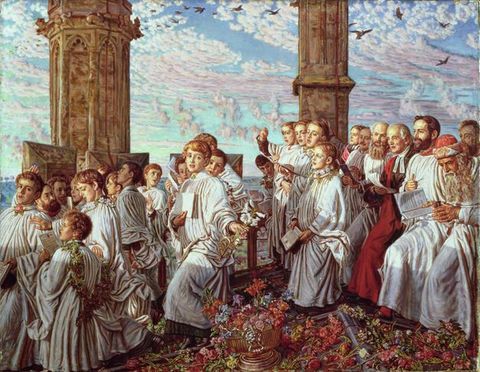
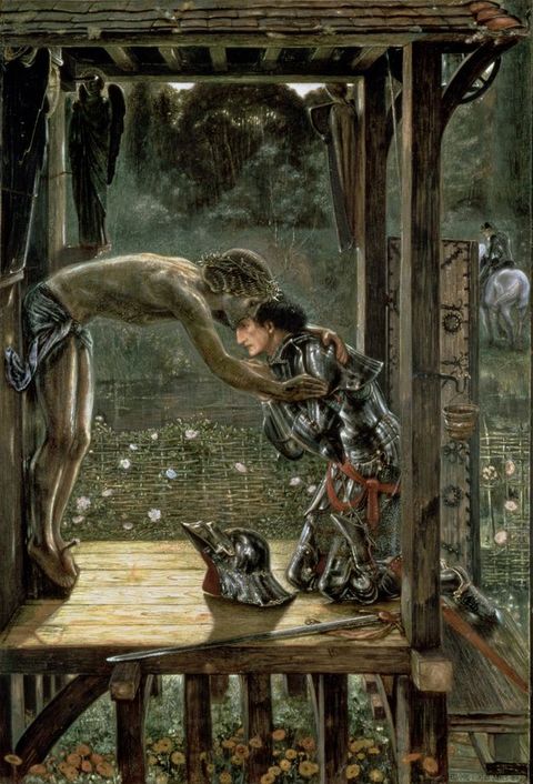
It is unsurprising to find a knight in armour in this design, given that they feature frequently in Pre-Raphaelite paintings. His inclusion demonstrates the pertinence of this figural type in the popular conception of Pre-Raphaelite art at this time, and connotes romantic chivalry—he gazes longingly at but does not engage with the haloed goddess of beauty—and fraternal loyalty through the association of Arthurian knights with comradeship. Burne-Jones’s work probably provides the movement’s most significant body of knightly imagery. His name on the poster focuses the broader association of Pre-Raphaelitism’s interest in medievalism and romance. Robertson’s knight could have been influenced by a number of Burne-Jones’s pictures. For example, his position against a dense wall of flowers recalls his Briar Rose series, a reference that signifies the Pre-Raphaelites’ attention to fairytale romances and stories of enchantment.50 There is a strong formal resemblance with the right-facing gaze in profile of the knight in Le chant d’amour, although Burne-Jones’s figure lacks a helmet and weapons (fig. 17).51 The Merciful Knight, a painting signalled as a major work in the Goupil exhibition by being the first illustration of just eight reproduced in the accompanying catalogue, may be another pertinent influence (fig. 18).52 In the painting, Burne-Jones depicts a knight kneeling in supplication before a sculpture of Christ on the cross, which has come to life to embrace him for his decision to forgive rather than destroy his enemy. Like Robertson’s figure, Burne-Jones’s Merciful Knight is shown with his face in profile (albeit facing the opposite direction), and is dressed in dark metallic armour with gold accents. His sword and helmet lie discarded on the ground, and his empty red scabbard points outwards beyond the painting in a similar manner to Robertson’s knight’s red lance.53 Seen through the lens of The Merciful Knight, the figure in Robertson’s poster can similarly be understood as a worshipper before an ideal. But, while Burne-Jones depicts a sculpture miraculously taking on flesh, Robertson presents his knight in devotion before a Rossettian painterly archetype made manifest.
50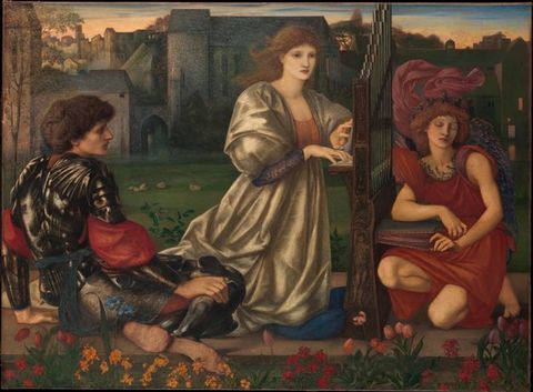
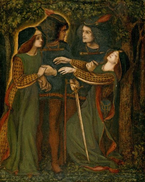
Beside the knight stands a woman in a green gown trimmed with red at the neckline, her hair covering her ears like voluminous clouds.54 Her fingers are intertwined in a prayer-like gesture as she looks towards the goddess with heavy eyelids and an unfocused gaze. Her black and gold bourrelet—a type of padded-roll hat—decorated with a criss-crossing golden ribbon, anchors the figure in the fifteenth century. This detail emphasises the association of Pre-Raphaelitism with medievalism, which is also echoed by the poster’s rich earthy colours, Lombardic capitals, and of course the armoured knight. The position of her hands also highlights the picture’s devotional character, with the direction of her gaze—like that of her companions—suggesting the Pre-Raphaelites’ devotion to beauty. Indeed, Robertson’s arrangement of figures appears to provide a nod to the sacra conversazione genre. The close proximity of the figures to each other and the suggested adoration narrative recalls early Renaissance works such as Sandro Botticelli’s Madonna of the Magnificat (fig. 19).55 The modelling of this figure and the colours of her costume resemble those in Rossetti’s How They Met Themselves, from which the artist produced two pen-and-ink drawings (the first, produced in 1851, was lost or destroyed; a replacement produced in 1860 is now in the Fitzwilliam Museum) and two watercolours (fig. 20).56 Rossetti’s painting illustrates the moment when two lovers encounter their doppelgängers when walking in a wood at night. Robertson’s integration of this model into his poster not only reinforces the strength of Rossetti’s association with Pre-Raphaelitism at this time but also adds further narrative detail to the picture. Where Rossetti’s figure clasps hands with her lover as she stares in shock at her double, Robertson’s figure in a wood stands before a seemingly deified version of herself, the faces of both women being Rossettian types.
54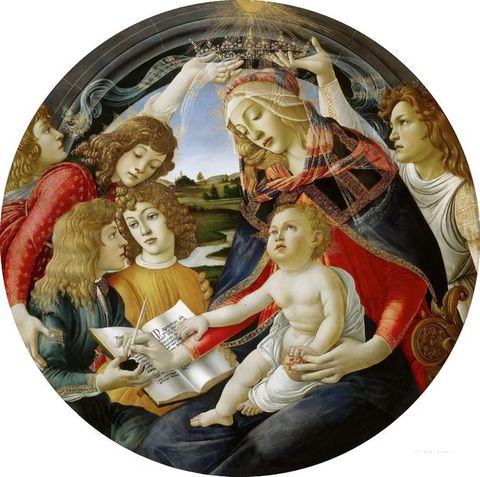
The mirroring of feminine forms also appears in Rossetti’s watercolour Rosa Triplex, which Robertson owned and could certainly have had in mind when designing his poster for the Goupil show (fig. 21).57 While Rossetti depicts a younger female subject, the two designs share several features: from the woman’s red hair and vacant expression to the heart-shaped medallion Rossetti’s central figure wears over a red gown, to the positioning of the figures at a balcony ledge separating the subject from the viewer, and the background of foliage and red and white flowers. The poster’s repetition of two Rossettian women echoes Rosa Triplex’s left and central figures in the turn of their heads and their subtle duplication, a visual parallel made all the more plausible by Robertson’s daily proximity to the work.
57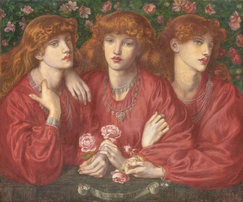
The perception of the poster’s overarching debt to the general Rossettian woman was attested by contemporaries, but Robertson’s figure has a deeper resonance. He recalled in 1931 how, during a visit to a loan exhibition, he had “shied violently across the room at a terrible work which, to my shocked and instantly averted gaze, announced itself as an unusually bad Rossetti”, how “for very love of Rossetti I would not look again” and sought to forget it “as soon as possible”.58 This turned out to be impossible:
5859Some days afterwards I began to be haunted by a beautiful Presence, vague, half-remembered. A wonderful face, gentle and noble, with eyes that dreamed and lips that faintly smiled. . . . Where had I seen this? In a picture, surely, but in what picture? I had seen no such beautiful picture very lately. Suddenly it came to me—it was the picture that Rossetti was trying to paint when he produced the lilac and purple horror. How strong and insistent must that original purpose have been, that the mental photograph, taken during that momentary glance, should be that of the picture that might have been instead of the picture that was. Through the slimy surface and muddy colour the beauty, dreamed of but unattained, had shone out and stamped itself upon my mind despite the evidence of my eyes.59
Robertson’s poster—produced some thirty years earlier—appears enamoured with the same effect. That these Rossettian figures are not copies of specific figures is not because he was unable to choose or to imitate Rossetti’s designs. Instead, his depictions of a composite type recall the power of Rossetti’s forms to lodge themselves in the viewer’s mind as a Platonic ideal.
We may wonder, from the inclusion of his name on the poster, where Ford Madox Brown is to be found in the design. Instead of a figural representation of his work, Robertson appears to represent Brown through the arrangement of his four figures. Where he is indebted to the sacra conversazione for the figures’ closeness and the adoration narrative, he borrows from Brown’s Cordelia’s Portion its semi-circular arrangement of three figures (two male, one female) in profile on the far left and the outwards turn of the red-haired Cordelia on the right (fig. 22). The Southampton version had recently been exhibited in Birmingham in 1891 and at the Guildhall in London in 1894.60 Robertson may also have consulted the reproduction of Brown’s painting in the accompanying catalogue to the Guildhall exhibition.61 It is therefore possible that he drew on Brown in his arrangement of the figures. This embedded allusion recalls the Pre-Raphaelite Brotherhood’s early days, when Brown had been a guiding force despite not being a part of the group.
60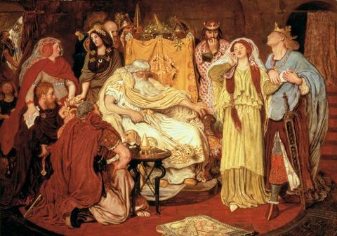
Bricolage and Living Textuality
If Robertson had designed his poster with just three figures, or replaced a character or the background with another Pre-Raphaelite reference or archetype, would the poster have successfully communicated the concept of Pre-Raphaelite art? Most likely, yes. This is not to say that the definition of Pre-Raphaelite art was—or is—fixed. If a poster advertising Pre-Raphaelite art were to be created today, it would most probably look different from A Pre-Raphaelite Collection. For many people in 2026, the first image conjured by the term “Pre-Raphaelite” may be John Everett Millais’s Ophelia (1852), John William Waterhouse’s Lady of Shalott (1888), or even the iconic red-haired musician Florence Welch of the band Florence + The Machine. Recognition of the diachronic fluidity of this term and its associated imagery invites us to consider Pre-Raphaelitism’s interior semiotic construction and the term’s wider deployment more deeply.
The fragmentary nature of Pre-Raphaelitism’s communicative process, as embodied by this poster, speaks to Claude Lévi-Strauss’s characterisation of mythical thought as “a kind of intellectual ‘bricolage’” that “expresses itself by means of a heterogeneous repertoire which, even if extensive, is nevertheless limited”.62 In his construction of his hybrid Pre-Raphaelite image, Robertson is a bricoleur “with a set of tools and materials which is always finite and is also heterogenous because what it contains . . . is the contingent result of all the occasions there have been to renew or enrich the stock or to maintain it with the remains of previous constructions or deconstructions”.63 Pre-Raphaelitism is thus conceptually polysemous even as it maintains borders. As noted, Pre-Raphaelitism cannot be transmitted through the presence of any knightly figure; there is a precision to the knight’s costume, posing, and emotive form that aligns him with Pre-Raphaelitism. This polysemous yet refined character of Pre-Raphaelitism is what allows Robertson to deploy a range of visual tools to convey a coherent message while constructing his advertisement for the Goupil exhibition.
62The ability to play on a fragmentary definition of Pre-Raphaelitism in a public advertisement—a medium that is contingent on its legibility to the masses—speaks to the mode’s significance and familiarity in popular culture. With this fragmentary quality in mind, I propose that this semiosis indicates Pre-Raphaelitism’s status at the end of the nineteenth century as what I call a conceptual cult object.64 The semiologist Umberto Eco has stated that the transformation of a book or film into a cult object requires more than that the work simply be loved: “It must provide a completely furnished world, so that its fans can quote characters and episodes as if they were part of the beliefs of a sect, a private world of their own”. However, to be marked as a cult object, the work cannot just be intensely familiar to its adherents. For example, Eco argues that a cult movie is defined by its “ramshackle, rickety, unhinged” nature (as opposed to the “perfect movie” that “remains in our memory as a whole, in the form of a central idea or emotion”) that allows it to “[survive] as a disconnected series of images, of peaks, of visual icebergs”: “It must live on, and because of, its glorious ricketiness”.65 As represented by this poster, Pre-Raphaelitism is able to live as a collage of attributes, some stylistic, some iconographic, and some thematic. While Pre-Raphaelitism transcends a singular medium, it stands as a concept that, like other cult objects, can be broken up and dislocated “so that one can remember only parts of it, irrespective of their original relationship with the whole” but still retain meaning. That Pre-Raphaelite art might be remembered as a series of visual peaks composed of a chorister, a knight, a medieval woman, and a haloed goddess of beauty, yet retain its meaning as an image of “Pre-Raphaelitism”, encapsulates the notion of a cult object.
64Some scholars have referred to “the bewildering mutations of the term ‘Pre-Raphaelite’” and the concept’s “inherent fluidity” as evidence of its function as “an arbitrary sign”.66 However, as this poster demonstrates, there are still boundaries to the definition of Pre-Raphaelitism. Eco emphasises that the cult movie must still “have some quality” and, echoing Lévi-Strauss, “display certain textual features” so that “outside the conscious control of its creators, it becomes a sort of textual syllabus, a living example of living textuality”.67 It is this idea that I wish to underscore. The evolution of the primary attributes and imagery associated with the term “Pre-Raphaelite”, arising from its interpretation by and interactions with its audience, does not equate to a loss of meaning altogether. Instead, the term should be recognised as a living text that has grown beyond its original definition and extends beyond the ownership of its originators.
66Some will reject Pre-Raphaelitism’s status as living textuality, their argument being that Pre-Raphaelitism constitutes a closed text. This was a point of discussion at Tate’s “Rossettis: In Relation” conference in 2023, which saw some attendees argue for a stricter, more limited application of the term, in line with its “original” usage.68 However, this argument falls into the trap of the etymological fallacy—that a word’s original definition is the only correct one. As Wittgenstein observed, the meaning of a word is found in how it is used by a society, an approach that embraces the ways in which language can change. The perception that Pre-Raphaelitism has ever maintained a singular definition has been refuted by scholars such as Michaela Giebelhausen and Tim Barringer, who affirm that “Pre-Raphaelitism was not a monolithic entity with a tightly focused aesthetic agenda; it was different things at different times in its long history that spanned more than half a century”.69 Nevertheless, the wish to limit the application of the label to its so-called original usage has been a long-term concern within the field and was identified as a “common refuge” in Pre-Raphaelite studies as far back as 1965.70 While this argument is understandable, attempts to confine the name and its meaning within a rule-based framework lead to their own problems. For example, to limit use of the term to the artists belonging to the Brotherhood excludes major players both in the early stages of the movement, such as Charles Allston Collins and Walter Howell Deverell, and in its later stages, such as Burne-Jones. With no women granted entry to the short-lived fraternity (it had ceased activities as a social group by January 1853), does this mean no woman’s art can be classified as “Pre-Raphaelite”? Jan Marsh and Pamela Gerrish Nunn’s numerous publications and exhibitions challenge this presumption.71 This rule also begs the question of whether a member of the Brotherhood should be labelled as “Pre-Raphaelite” for the whole of their career. From the repeated use of Rossetti’s later pictures on the covers of Pre-Raphaelite scholarly texts and coffee table books, this appears to have been the case. However, applying the same rubric, should Millais’s chocolate-box pictures of children, such as Bubbles, originally entitled A Child’s World (1886), be classified as “Pre-Raphaelite”? The inclination to reject this association reveals the shortcomings of the rule-based approach. The argument that “Pre-Raphaelite” should apply only to the members of the Brotherhood during their active years as a society is not only ahistorical in the sense of its contemporary understanding and usage, which saw non-Brotherhood artists embraced within the group’s ranks, but also limits the scope of scholarly analysis.72 Re-engagement with the term through the lens of the cult object provides a framework for studying its power, transmediality, and longevity. Its “ricketiness” is what allows the category of “Pre-Raphaelite art” to embrace Hunt’s The Scapegoat (1854–55) alongside Rossetti’s Astarte Syriaca (1877); to take the form of chairs, tables, knives, forks, and coal scuttles in 1876; to be represented as a collage of medievalism, religiosity, beauty, and mysticism in 1896 by Robertson; and to be cited today in connection with film and television design and types of music, fashion, hair colour and styling, make-up, and interior design. Where some might consider MAC Cosmetics’ production of a vampy plum-toned lipstick named “Pre-Raphaelite” in 2013 to be representative of the vandalism of Pre-Raphaelitism’s “true” meaning and a danger to its overall coherence, others (myself included) would argue that such a product is an exciting avenue of semantic development that speaks to Pre-Raphaelitism’s popular deployment and modern conceptualisation around ideas of beauty, femininity, gender, and sexuality. While different people in 1896 and today may have different ideas of what constitutes the peaks of the conceptual “Pre-Raphaelite” iceberg, the spectrum of opinion only reconfirms its status as an example of living textuality.
68In 1991 Mieke Bal and Norman Bryson proposed a semiotic turn for art history, positioning “semiotics as a perspective, raising a set of questions around and within the methodological concerns of art history itself”.73 This article belongs to a wider project that argues for a semiotic turn for Pre-Raphaelitism. More careful consideration of this term and its diachronic signification can enhance studies of Pre-Raphaelite art’s reception and interpretation, as well as Pre-Raphaelitism’s wider transmedial deployment. It is an approach that could benefit the study of other movements (in art history and beyond), whereby more attention might be given to the capacity of language—in particular, stylistic categorisation—to influence, or even direct, the viewing experience, and to how this may have changed over time.
73Past scholars have acknowledged that Pre-Raphaelitism “was different things at different times in its long history that spanned more than half a century”, while also noting that it may be “hard to pin down exactly what the term ‘Pre-Raphaelite’ encompassed during the second half of the nineteenth century”.74 This poster, among other objects designed for public consumption, reflects the communal meanings and associations of Pre-Raphaelite art at a specific point in time. It thus counters the false presumption that “Pre-Raphaelitism cannot be defined; it was too various”, and demonstrates that fluidity of meaning does not equate to a loss of meaning altogether.75
74Acknowledgements
I would like to thank the Humanities Research Centre at the University of York, the University of Delaware, and Delaware Art Museum for funding this research, and the University of Delaware and Delaware Art Museum for providing access to resources.
About the author
-
 Susie Beckham is Postdoctoral Associate at the Yale Center for British Art. She was recently Research Fellow at the Humanities Research Centre at the University of York and the 2025 Amy P. Goldman Fellow in Pre-Raphaelite Studies at the University of Delaware and Delaware Art Museum. She received her PhD in history of art from the University of York with her research on the origins, evolution, temporal nuance, and reception of the term “Pre-Raphaelite” from the mid-nineteenth century to the present day. Her research has been published in The British Art Journal and The Burlington Magazine and she is currently completing her first monograph on the creation and application of the term “Pre-Raphaelite”, as used in Britain, between 1848 and 1920.
Footnotes
-
1
In his report on the picture sales of 1896, the critic Albert Charles Robinson Carter highlighted “Leathart’s celebrated collection of works by the pre-Raphaelites” at Goupil as an instance of the growth of private sales, positioning it a key example of the “open secret that nowadays many important collections, particularly of moder[n] examples, change hands without appearing at auction at all”. A. C. R. Carter, “Picture Sales of 1896”, Art-Journal, September 1896, 284. ↩︎
-
2
Goupil Gallery, A Pre-Raphaelite Collection, intro. William Michael Rossetti, 2nd ed. (Goupil Gallery, 1896). ↩︎
-
3
“Literature, etc.”, Speaker 14 (11 July 1896): 30; “A Pre-Raphaelite Collection”, Builder 70, no. 2784 (13 June 1896): 507. ↩︎
-
4
For more on Thomson see Anne Helmreich, “The Art Dealer and Taste: The Case of David Croal Thomson and the Goupil Gallery, 1885–1897”, Visual Culture in Britain 6, no. 2 (Autumn 2005): 31. ↩︎
-
5
Roland Barthes, “Rhetoric of the Image”, in Image—Music—Text, trans. Stephen Heath (Hill & Wang, 1977), 32–33. ↩︎
-
6
Deborah Cherry and Griselda Pollock, “Woman as Sign in Pre-Raphaelite Literature: A Study of the Representation of Elizabeth Siddall”, Art History 7, no. 2 (June 1984): 206–27; Deborah Cherry and Griselda Pollock, “Patriarchal Power and the Pre-Raphaelites”, Art History 7, no. 4 (December 1984): 480–95. ↩︎
-
7
For more on the production of semiotic myth, see Roland Barthes, Mythologies, trans. Annette Lavers (Noonday Press, 1991), 58–59. ↩︎
-
8
M. H. Spielmann, “Our Rising Artists: Mr. W. Graham Robertson”, Magazine of Art 24 (1900): 80–81. ↩︎
-
9
A notable exception is an essay by Annabel Watts for an exhibition on Graham Robertson at the Maas Gallery (16 April–3 May 2024). Maas Gallery, Walford Graham Robertson (1866–1948), 4–9, https://www.maasgallery.co.uk/usr/library/documents/main/walford-graham-robertson-1-.pdf. ↩︎
-
10
“M. Graham Robertson, qui non seulement a su fournir, avec son petit groupe de femmes à la manière de Rossetti, un effet de couleur d’une finesse remarquable, mais que, en même temp, a tenu compte du style et des nuances des productions des artistes exposants pour en reproduire habilement le type”. Maurice Bauwens et al., Les affiches étrangères illustrées (G. Boudet, 1897), 74. ↩︎
-
11
Reproductions and citations of the poster appear in the following sources but lack scholarly analysis: Hayward Cirker and Blanche Cirker, eds., The Golden Age of the Poster (Dover, 1971), 59; Bryan Holme, Advertising: Reflections of a Century (Viking Press, 1982), 24; Julia King, The Flowering of Art Nouveau Graphics (Peregrine Smith Books, 1990), 32, which incorrectly dates it to 1898 and attributes it to Rossetti. ↩︎
-
12
Walford Graham Robertson, Time Was: The Reminiscences of W. Graham Robertson (Hamish Hamilton, 1931); Letter from Walford Graham Robertson to James McNeill Whistler, 13 April [1891], MS Whistler R97, 05197, The Correspondence of James McNeill Whistler, University of Glasgow, https://www.whistler.arts.gla.ac.uk/correspondence/people/display/?cid=5197&nameid=Robertson_WG&sr=0&rs=7&surname=robertson&firstname=. ↩︎
-
13
Robertson, Time Was, 36–46, 56–63, 73–85, 88. ↩︎
-
14
Percy H. Bate, The English Pre-Raphaelite Painters: Their Associates and Successors (George Bell & Sons, 1899), [117–18]. ↩︎
-
15
Spielmann, “Our Rising Artists”, 75. ↩︎
-
16
Spielmann, “Our Rising Artists”, 80. ↩︎
-
17
This dating counters Spielmann’s report that Robertson first exhibited his work in 1891. Spielmann, “Our Rising Artists”, 75. ↩︎
-
18
Robertson, Time Was, 219. Robertson was celebrated as one of the “artists of unusual skill” who “have lent their services and advice to the manager” of the theatre. Augustin Daly, Memories of Daly’s Theatres, with passing recollections of others, including a record of plays and actors at the Fifth Avenue Theatre and Daly’s Theatre, 1869–95 ([New York,] 1897), 87–88. ↩︎
-
19
W. Graham Robertson, “[Costume designs and scene sketches for the Daly production of Two Gentlemen of Verona] R.G. [graphic]” (1895), no. 36399, ART Box R652 no. 8, 17–38, Folger Shakespeare Library, Washington, DC, https://digitalcollections.folger.edu/bib265536-351236. ↩︎
-
20
Baton, “Music”, Weekly Dispatch, 15 December 1889, 6; “Five Songs by Ernest Birch”, Hastings and St Leonards Observer, 25 May 1889, 7; “Music Sent for Criticism—J. & J. Hopkinson, London”, Musical Courier 26, no. 689 (17 May 1893): 23. Robertson’s illustration of the Marquis of Lorne’s poem “A Grave in London”, English Illustrated Magazine 10, no. 116 (May 1893): 600; William Archer, “The Theatres”, English Illustrated Magazine 10, no. 116 (May 1893): 601–3. ↩︎
-
21
Ruth E. Iskin, The Poster: Art, Advertising, Design, and Collecting, 1860s–1900s (University Press of New England, 2014), 6. ↩︎
-
22
Gleeson White, “At Five O’Clock”, Windsor Magazine 1 (January 1895): 115. ↩︎
-
23
Iskin, The Poster, 6. ↩︎
-
24
Iskin, The Poster, 6. ↩︎
-
25
Charles Hiatt, Picture Posters: A Short History of the Illustrated Placard, with many reproductions of the most artistic examples in all countries (George Bell & Sons, 1895), 220. ↩︎
-
26
Iskin, The Poster, 48–49. ↩︎
-
27
His father, Graham Moore Robertson, died in 1884, leaving a personal estate of £177,193 (equivalent to £19,585,467 today). When he died in 1948, Walford Graham Robertson himself left a personal estate of £474,677 (equivalent to £15,352,057). England & Wales, National Probate Calendar (Index of Wills and Administrations), year 1884 (192); year 1948 (776). ↩︎
-
28
Iskin, The Poster, 49; “Concerning Ourselves”, Poster: An Illustrated Monthly Chronicle 1, no. 1 (June 1898): 4. ↩︎
-
29
M. H. Spielmann, “Posters and Poster-Designing in England”, Scribner’s Magazine 18, no. 1 (July 1895): 37. ↩︎
-
30
“Aujourd’hui, dès qu’un artiste songe à exposer quelques-unes ses œuvres, il crée une affiche qui sert de carte d’invitation. M. Phil May, M. Brangwyn et M. Raven-Hill ont suivi cet exemple. M. Arthur Studd, M. A.-D. Peppercorn et M. Wilson Steer ont vu leurs affiches d’exposition publiées par la maison Goupil et Ce”. Bauwens et al., Les affiches étrangères illustrées, 74. ↩︎
-
31
Spielmann, “Posters and Poster-Designing”, 43. See also Arsène Alexandre et al., The Modern Poster (Charles Scribner’s Sons, 1895), 54. Confirmation of Sinet exhibition date: University of Glasgow, Exhibition Culture in London 1878–1908, https://www.exhibitionculture.arts.gla.ac.uk/indexlist.php?kid=432. ↩︎
-
32
Hiatt, Picture Posters, 243. ↩︎
-
33
Hiatt, Picture Posters, 243. ↩︎
-
34
Justin McCarthy, “The Pre-Raphaelites in England”, Galaxy 21, no. 6 (June 1876): 725, 727. ↩︎
-
35
Max Horkheimer and Theodor W. Adorno, “The Culture Industry: Enlightenment as Mass Deception”, in Dialectic of Enlightenment: Philosophical Fragments, ed. Gunzelin Schmid Noerr, trans. Edmund Jephcott (Stanford University Press, 2002), 99. ↩︎
-
36
The juxtaposition of these medievalised letters among Robertson’s freehand text also alludes to the popular nineteenth-century practice of taking and collecting cuttings from medieval manuscripts that were then assembled (sometimes to spell out words) and pasted into albums or scrapbooks. Sandra Hindman and Michael Camille, “‘Specimens’: Transformations of Illuminated Manuscripts in the Nineteenth Century”, in Manuscript Illumination in the Modern Age: Recovery and Reconstruction, ed. Sandra Hindman and Nina Rowe (Mary and Leigh Block Museum of Art, 2001), 68–69, 73–80; Margaret Connolly, “From Drawing Room to Sale-Room: Albums of Medieval Manuscript Cuttings in the 1920s”, in The Pre-Modern Manuscript Trade and Its Consequences, ca. 1890–1945, ed. Laura Cleaver et al. (Arc Humanities Press, 2024), 87. ↩︎
-
37
Roberston would have seen Rossetti’s A Sea-Spell (1877), whose subject is adorned with a similar flower crown, at the Burlington exhibition of 1883. ↩︎
-
38
Examples of glass orbs can be found in Edward Burne-Jones’s Astrologia (1865) and The Days of Creation (1870–76); Frank Dicksee’s The Magic Crystal (1894); and Simeon Solomon’s Toilet of a Roman Lady (1869). ↩︎
-
39
Robertson would have been able to view this painting at a Christie’s sale on 30 April 1887 (lot 82) and again on 19 May 1894 (lot 34). Virginia Surtees, The Paintings and Drawings of Dante Gabriel Rossetti (1828–1882): A Catalogue Raisonné, 2 vols. (Clarendon Press, 1971), 1:99. ↩︎
-
40
D. M. R. Bentley, “‘Of Venus and of Cupid—Strange Old Tales’ in the Work of D. G. Rossetti”, Victorian Review 34, no. 2 (Fall 2008): 85. ↩︎
-
41
Robertson, Time Was, 86. ↩︎
-
42
Robertson, Time Was, 87. ↩︎
-
43
A similar dynamic has been observed in Rossetti’s own imitation of Botticelli. Elizabeth Prettejohn, Modern Painters, Old Masters: The Art of Imitation from the Pre-Raphaelites to the First World War (Yale University Press, 2017), 20. ↩︎
-
44
Sidney Colvin, “English Painters and Painting in 1867”, Fortnightly Review 2, no. 10 (October 1867): 472. Colvin was an early proponent of this reading of Pre-Raphaelite art and, while other critics certainly held opposing views, this perception grew in the press from this point onwards. ↩︎
-
45
A.Y.–R.S., “Pre-Raphaelitism from Different Points of View”, Fraser’s Magazine 53, no. 318 (June 1856): 686. This perception is humorously heightened in Florence Claxton’s The Choice of Paris: An Idyll (1860–62, multiple versions). ↩︎
-
46
Robertson would have seen Rossetti’s Ecce Ancilla Domini! (The Annunciation, 1849–50), at the memorial exhibition for Rossetti at the Royal Academy in 1883 (and possibly again at its sale at Christie’s in 1886). The absence of a halo for Robertson’s figure indicates his non-holy status. As such, despite similarities with Rossetti’s Gabriel (i.e., his turning towards a haloed red-headed woman and the angle of his bent arm), it probably has an alternative, more direct, source. ↩︎
-
47
Barthes, “Rhetoric of the Image”, 38–39. ↩︎
-
48
Both versions of this picture had been exhibited a number of times prior to Robertson’s production of his poster and had received extensive press coverage. Judith Bronkhurst, William Holman Hunt: A Catalogue Raisonné, 2 vols. (Yale University Press, 2006), 1:265–69. The notoriety of the painting saw it attributed with “reviv[ing] public interest to a great extent” in its subject matter (illustrating the “old custom connected with that ancient college”). Laura Alex Smith, “On Some Students’ Songs”, Gentleman’s Magazine 272 (January–June 1892): 175. ↩︎
-
49
William Holman Hunt, letter to the editor, “Mr. Holman Hunt’s ‘May Morning’”, Pall Mall Gazette, 4 November 1891, 3. ↩︎
-
50
Robertson describes how he encountered the first panel showing “the Prince making his way through the wood towards the enchanted castle” on his first visit to Burne-Jones’s studio as an art student. Robertson, Time Was, 77. The Prince Enters the Briar Wood from the first Briar Rose series (1869) remained in Burne-Jones’s studio collection until his death in 1898, and this is probably the version Roberton refers to. William Waters et al., “The Prince Entering the Briar Wood (The Prince Enters the Briar Wood), Briar Rose Series—1st version 1869: Provenance”, Burne-Jones: Catalogue Raisonné, https://www.eb-j.org/browse-artwork-detail/MTY1Ng== . ↩︎
-
51
Robertson could have seen Le chant d’amour at the New Gallery’s retrospective on Burne-Jones in 1892–93. ↩︎
-
52
Robertson could also have seen this work at the New Gallery’s retrospective in 1892–93. ↩︎
-
53
Robertson’s knight might also be seen as a composite image of Burne-Jones’s many medieval male figures in dark armour, as in Princess Sabra led to the Dragon (1865–97), which Robertson could have seen in the artist’s studio and at McLean’s Gallery in 1895 where the full cycle for The Legend of St. George and the Dragon series was exhibited: “Princess Sabra led to the Dragon, St George and the Dragon series: ‘Exhibitions’”, Burne-Jones: Catalogue Raisonné, https://www.eb-j.org/browse-artwork-detail/MTMxNg==. ↩︎
-
54
A similar dipped hat shape and detailing are present in Robertson’s costume design for Sylvia in act 2 of Two Gentlemen of Verona, where he describes the character’s cap as being made from a “thin white material stretched on wire shape and crossed[?] with gold braid & studded with pearls”. Robertson, no. 36407, Costume designs and scene sketches [Sylvia, 2.1 and 2.4], Folger Shakespeare Library, ART Box R652 no. 8, 17–38, https://digitalcollections.folger.edu/bib265536-351236. ↩︎
-
55
Armoured knights occasionally appear in such images, with the enthroned Virgin flanked by St. George. See, for example, Hans Memling’s The Virgin and Child with an Angel (circa 1480) and Giovanni Martini da Udine’s The Virgin and Child with Saints (circa 1500–25), both accessible to Robertson in the National Gallery at this time. ↩︎
-
56
Surtees, The Paintings and Drawings of Dante Gabriel Rossetti, 1:74–75. Robertson would have seen the Fitzwilliam watercolour at the Burlington Fine Art Club’s memorial exhibition for Rossetti in 1883, while the alternative watercolour and Fitzwilliam pen-and-ink drawing could be seen at the Royal Academy’s memorial exhibition down the street. The two watercolours also appeared at auction at Christie’s in the years that followed: one was sold on 3 April 1886 and the other on 5 May 1891. ↩︎
-
57
The Rossetti catalogue raisonné records this version of Rosa Triplex being in the Royal Academy memorial exhibition of 1883, at London’s Guildhall in 1892, and at the Grafton Gallery in 1894. Surtees, Catalogue Raisonné, 1:136. Surtees records that Robertson owned the painting by 1897, as he lent the work to a New Gallery show in 1897–98. What is not noted in the catalogue raisonné is that Robertson already owned Rosa Triplex when it was shown at the Guildhall in 1892, as shown in the exhibition catalogue. Corporation of London, Descriptive Catalogue of the Loan Collection of Pictures (Charles Skipper & East, 1892), [item 159]. The catalogue for the Royal Jubilee Exhibition in 1887 lists Mills as the owner of Rosa Triplex, so the work must have changed hands between the two shows. Royal Jubilee Exhibition, Manchester 1887: Official Catalogue (John Heywood, 1887), 360. ↩︎
-
58
Robertson, Time Was, 86–87. ↩︎
-
59
Robertson, Time Was, 87. ↩︎
-
60
Mary Bennett, Ford Madox Brown: A Catalogue Raisonné, 2 vols. (Yale University Press for Paul Mellon Centre for Studies in British Art, 2010), 1:230. ↩︎
-
61
A. G. Temple, Masterpieces of Art—Reproductions by the Collotype Process of Some of the Works in the Loan Exhibition of Pictures Held in the Art Gallery of the Corporation of London, at the Guildhall, 1894 (Blades, East & Blades, 1894), facing p. 42. ↩︎
-
62
Claude Lévi-Strauss, The Savage Mind (Weidenfeld & Nicolson, 1966), 17. ↩︎
-
63
Lévi-Strauss, The Savage Mind, 17. ↩︎
-
64
For more on Pre-Raphaelitism’s transformation into a cult object, see Susie Beckham, “The Meaning of the Term ‘Pre-Raphaelite’ (1848–2024)” (PhD thesis, University of York, 2024), ch. 4. ↩︎
-
65
Umberto Eco, “Casablanca: Cult Movies and Intertextual Collage”, in Travels in Hyper Reality: Essays, trans. William Weaver (Harcourt Brace Jovanovich, 1986), 198. ↩︎
-
66
Michaela Giebelhausen and Tim Barringer, “Introduction”, in Writing the Pre-Raphaelites: Text, Context, Subtext, eds. Michaela Giebelhausen and Tim Barringer (Ashgate, 2009), 11. ↩︎
-
67
Eco, “Casablanca”, 199. ↩︎
-
68
Paul Mellon Centre for Studies in British Art, “Rossettis: In Relation”, Conference, Tate Britain, London, 15–16 June 2023, YouTube, Day 2, Panel 5, “International Exchanges”, chaired by Eduardo De Maio, featuring Helena Cox, Sophie Lynford, and Sadbh Kellett, https://www.youtube.com/watch?v=ID3Tvb75r2o. Notable comments include: “[Pre-Raphaelitism] is a very period-specific term. . . . it is our responsibility as scholars and as curators to continue to push on that term in our work to really not allow everything to be ‘Pre-Raphaelite’ hair, ‘Pre-Raphaelite’ curtains, ‘Pre-Raphaelite’ everything, because it was used very, very specifically by the artists that came up with that term, and I feel responsibility to that original definition” (Sophie Lynford, Annette Woolard-Provine Curator of the Bancroft Pre-Raphaelite Collection, Delaware Art Museum); and “‘Pre-Raphaelites’ are the original Brotherhood” (Patricia O’Connor, Lifetime President of the Pre-Raphaelite Society). ↩︎
-
69
Giebelhausen and Barringer, “Introduction”, 4. ↩︎
-
70
William E. Fredeman, Pre-Raphaelitism: A Bibliocritical Study (Harvard University Press, 1965), 34. ↩︎
-
71
Examples of challenges include Jan Marsh, Pre-Raphaelite Sisterhood (Quartet Books, 1985); Jan Marsh and Pamela Gerrish Nunn, Women Artists and the Pre-Raphaelite Movement (Virago, 1989); Jan Marsh and Pamela Gerrish Nunn, Pre-Raphaelite Women Artists (Manchester City Art Gallery, 1997); Pamela Gerrish Nunn, A Pre-Raphaelite Journey: The Art of Eleanor Fortescue-Brickdale (Liverpool University Press, 2012); and Jan Marsh et al., Pre-Raphaelite Sisters (National Portrait Gallery Publications, 2019). Examples of exhibitions include Pre-Raphaelite Women Artists at Manchester City Art Galleries (22 November 1997–22 February 1998), Birmingham Museum and Art Gallery (7 March–25 May 1998), and Southampton City Art Gallery (6 June–2 August 1998); and Pre-Raphaelite Sisters at the National Portrait Gallery (17 October 2019–26 January 2020). ↩︎
-
72
For more on the historic fluidity of the Pre-Raphaelite label, see Beckham, “The Meaning of the Term”, ch. 3. ↩︎
-
73
Mieke Bal and Norman Bryson, “Semiotics and Art History”, Art Bulletin 73, no. 2 (June 1991): 175. ↩︎
-
74
Giebelhausen and Barringer, Writing the Pre-Raphaelites, 4. ↩︎
-
75
Timothy Hilton, The Pre-Raphaelites (Oxford University Press, 1970), 9. ↩︎
Bibliography
Alexandre, Arsène, M. H. Spielmann, H. C. Bunner, and August F. Jaccaci. The Modern Poster. Charles Scribner’s Sons, 1895.
Archer, William. “The Theatres”. English Illustrated Magazine 10, no. 116 (May 1893): 601–8.
A.Y.–R.S. “Pre-Raphaelitism from Different Points of View”. Fraser’s Magazine 53, no. 318 (June 1856): 686–93.
Bal, Mieke, and Norman Bryson. “Semiotics and Art History”. Art Bulletin 73, no. 2 (June 1991): 174–208.
Barthes, Roland. Image—Music—Text. Translated by Stephen Heath. Hill & Wang, 1977.
Barthes, Roland. Mythologies. Translated by Annette Lavers. Noonday Press, 1991.
Bate, Percy H. The English Pre-Raphaelite Painters: Their Associates and Successors. George Bell & Sons, 1899.
Baton. “Music”. Weekly Dispatch, 15 December 1889, 6.
Bauwens, Maurice, Tadamasa Hayashi, La Forgue, Julius Meier-Graefe, and Joseph Pennell. Les affiches étrangères illustrées. G. Boudet, 1897.
Beckham, Susie. “The Meaning of the Term ‘Pre-Raphaelite’ (1848–2024)”. PhD thesis, University of York, 2024.
Bennett, Mary. Ford Madox Brown: A Catalogue Raisonné. 2 vols. Yale University Press for Paul Mellon Centre for Studies in British Art, 2010.
Bentley, D. M. R. “‘Of Venus and of Cupid—Strange Old Tales’ in the Work of D. G. Rossetti”. Victorian Review 34, no. 2 (Fall 2008): 83–102.
Bronkhurst, Judith. William Holman Hunt: A Catalogue Raisonné. 2 vols. Yale University Press, 2006.
Builder. “A Pre-Raphaelite Collection”. 70, no. 2784 (13 June 1896): 507.
Carter, A. C. R. “Picture Sales of 1896”. Art-Journal, September 1896, 282–85.
Cherry, Deborah, and Griselda Pollock. “Woman as Sign in Pre-Raphaelite Literature: A Study of the Representation of Elizabeth Siddall”. Art History 7, no. 2 (June 1984): 206–27.
Cherry, Deborah, and Griselda Pollock. “Patriarchal Power and the Pre-Raphaelites”. Art History 7, no. 4 (December 1984): 480–95.
Cirker, Hayward, and Blanche Cirker, eds. The Golden Age of the Poster. Dover, 1971.
Colvin, Sidney. “English Painters and Painting in 1867”. Fortnightly Review 2, no. 10 (October 1867): 464–76.
Connolly, Margaret. “From Drawing Room to Sale-Room: Albums of Medieval Manuscript Cuttings in the 1920s”. In The Pre-Modern Manuscript Trade and Its Consequences, ca. 1890–1945, edited by Laura Cleaver, Danielle Magnusson, Hannah Morcos, and Angéline Rais. Arc Humanities Press, 2024.
Corporation of London. Descriptive Catalogue of the Loan Collection of Pictures. Charles Skipper & East, 1892.
Daly, Augustin. Memories of Daly’s Theatres, with passing recollections of others, including a record of plays and actors at the Fifth Avenue Theatre and Daly’s Theatre, 1869–95. [New York,] 1897.
Eco, Umberto. Travels in Hyper Reality: Essays. Translated by William Weaver. Harcourt Brace Jovanovich, 1986.
Fredeman, William E. Pre-Raphaelitism: A Bibliocritical Study. Harvard University Press, 1965.
Giebelhausen, Michaela, and Tim Barringer, eds. Writing the Pre-Raphaelites: Text, Context, Subtext. Ashgate, 2009.
Goupil Gallery. A Pre-Raphaelite Collection. Introduction by William Michael Rossetti. 2nd ed. Goupil Gallery, 1896.
Hastings and St. Leonards Observer. “Five Songs by Ernest Birch”. 25 May 1889, 7.
Helmreich, Anne. “The Art Dealer and Taste: The Case of David Croal Thomson and the Goupil Gallery, 1885–1897”. Visual Culture in Britain 6, no. 2 (Autumn 2005): 31–49.
Hiatt, Charles. Picture Posters: A Short History of the Illustrated Placard, with many reproductions of the most artistic examples in all countries. George Bell & Sons, 1895.
Hilton, Timothy. The Pre-Raphaelites. Oxford University Press, 1970.
Hindman, Sandra, and Michael Camille. “‘Specimens’: Transformations of Illuminated Manuscripts in the Nineteenth Century”. In Manuscript Illumination in the Modern Age: Recovery and Reconstruction, edited by Sandra Hindman and Nina Rowe. Mary and Leigh Block Museum of Art, 2001.
Hindman, Sandra, and Nina Rowe, eds. Manuscript Illumination in the Modern Age: Recovery and Reconstruction. Mary and Leigh Block Museum of Art, 2001.
Holme, Bryan. Advertising: Reflections of a Century. Viking Press, 1982.
Horkheimer, Max, and Theodor W. Adorno. Dialectic of Enlightenment: Philosophical Fragments, edited by Gunzelin Schmid Noerr. Translated by Edmund Jephcott. Stanford University Press, 2002.
Hunt, W. Holman. Letter to the editor. “Mr. Holman Hunt’s ‘May Morning’”. Pall Mall Gazette, 4 November 1891, 3.
Iskin, Ruth E. The Poster: Art, Advertising, Design, and Collecting, 1860s–1900s. University Press of New England, 2014.
King, Julia. The Flowering of Art Nouveau Graphics. Peregrine Smith Books, 1990.
Lévi-Strauss, Claude. The Savage Mind. Weidenfeld & Nicolson, 1966.
Lorne, Marquis of. “A Grave in London”. English Illustrated Magazine 10, no. 116 (May 1893): 600.
Maas Gallery. Walford Graham Robertson (1866–1948). https://www.maasgallery.co.uk/usr/library/documents/main/walford-graham-robertson-1-.pdf.
Marsh, Jan. Pre-Raphaelite Sisterhood. Quartet Books, 1985.
Marsh, Jan, Peter Funnell, Charlotte Gere, Pamela Gerrish Nunn, and Alison Smith. Pre-Raphaelite Sisters. National Portrait Gallery Publications, 2019.
Marsh, Jan, and Pamela Gerrish Nunn. Women Artists and the Pre-Raphaelite Movement. Virago, 1989.
Marsh, Jan, and Pamela Gerrish Nunn. Pre-Raphaelite Women Artists. Manchester City Art Gallery, 1997.
McCarthy, Justin. “The Pre-Raphaelites in England”. Galaxy 21, no. 6 (June 1876): 725–32.
Musical Courier. “Music Sent for Criticism—J. & J. Hopkinson, London”. 26, no. 689 (17 May 1893): 23.
Nunn, Pamela Gerrish. A Pre-Raphaelite Journey: The Art of Eleanor Fortescue-Brickdale. Liverpool University Press, 2012.
Paul Mellon Centre for Studies in British Art. “Rossettis: In Relation”. Conference, Tate Britain, London, 15–16 June 2023, YouTube, @PaulMellonCentr. YouTube video. Day 2, Panel 5: International Exchanges. 1:38:41. https://www.youtube.com/watch?v=ID3Tvb75r2o.
Poster. “Concerning Ourselves”. Poster: An Illustrated Monthly Chronicle 1, no. 1 (June 1898): 3–4.
Prettejohn, Elizabeth. Modern Painters, Old Masters: The Art of Imitation from the Pre-Raphaelites to the First World War. Yale University Press, 2017.
Robertson, W. Graham. “[Costume designs and scene sketches for the Daly production of Two Gentlemen of Verona] R.G. [graphic]” (1895), no. 36399. ART Box R652 no. 8, 17–38. Folger Shakespeare Library, Washington, DC. https://digitalcollections.folger.edu/bib265536-351236.
Robertson, Walford Graham. Time Was: The Reminiscences of W. Graham Robertson. Hamish Hamilton, 1931.
Royal Jubilee Exhibition, Manchester 1887: Official Catalogue. John Heywood, 1887.
Smith, Laura Alex. “On Some Students’ Songs”. Gentleman’s Magazine 272 (January–June 1892): 174–86.
Speaker. “Literature, etc.”. 14 (11 July 1896): 30.
Spielmann, M. H. “Posters and Poster-Designing in England”. Scribner’s Magazine 18, no. 1 (July 1895): 34–47.
Spielmann, M. H. “Our Rising Artists: Mr. W. Graham Robertson”. Magazine of Art 24 (1900): 74–81.
Surtees, Virginia. The Paintings and Drawings of Dante Gabriel Rossetti (1828–1882): A Catalogue Raisonné. 2 vols. Clarendon Press, 1971.
Temple, A. G. Masterpieces of Art—Reproductions by the Collotype Process of Some of the Works in the Loan Exhibition of Pictures Held in the Art Gallery of the Corporation of London, at the Guildhall, 1894. Blades, East & Blades, 1894.
University of Glasgow. Exhibition Culture in London 1878–1908. https://www.exhibitionculture.arts.gla.ac.uk/index.php.
Waters, William, et al. Burne-Jones: Catalogue Raisonne. https://www.eb-j.org/.
Whistler, James McNeill. The Correspondence of James McNeill Whistler. University of Glasgow. https://www.whistler.arts.gla.ac.uk/correspondence/.
White, Gleeson. “At Five O’Clock”. Windsor Magazine 1 (January 1895): 111–17.
Imprint
| Author | |
|---|---|
| Date | 30 September 2026 |
| Category | Article |
| Review status | Peer Reviewed (Double Blind) |
| License | Creative Commons Attribution-NonCommercial 4.0 International (CC BY-NC 4.0) |
| Downloads | PDF format |
| Article DOI | https://doi.org/10.17658/issn.2058-5462/issue-30/sbeckham |
| Cite as | Beckham, Susie. “Walford Graham Robertson and the Construction of A Pre-Raphaelite Collection (1896).” In British Art Studies. London and New Haven: Paul Mellon Centre for Studies in British Art and Yale Center for British Art, 2026. https://doi.org/10.17658/issn.2058-5462/issue-30/sbeckham. |